Your Zendesk ticket form is often the first impression a customer has of your support experience. A clunky form can not only frustrate users but also lead to a surge in unnecessary support requests.
We've helped hundreds of businesses implement Zendesk, and here's the secret: the best forms are designed with the user in mind. They're clear, concise, and almost encourage people to submit them – but with the end goal of fewer, more accurate requests reaching your support team. After all, a well-designed form helps users categorize their issues efficiently, making it easier for agents to resolve them quickly.
So, how do you create a Zendesk ticket form that delights customers and streamlines your support process?
Use images in the "Issue type" field
The first step should be a clear issue selection field, ideally with icons or images. You can even hide other fields until a selection is made.
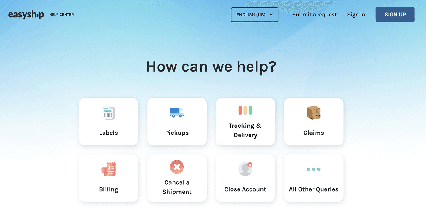
Take a look at Easyship's Zendesk form. See how the use of visuals makes it easy for users to identify their issue type? This is a perfect example of a user-friendly design that complements the brand and gets things rolling smoothly.
Here is the default Zendesk contact form for contrast.
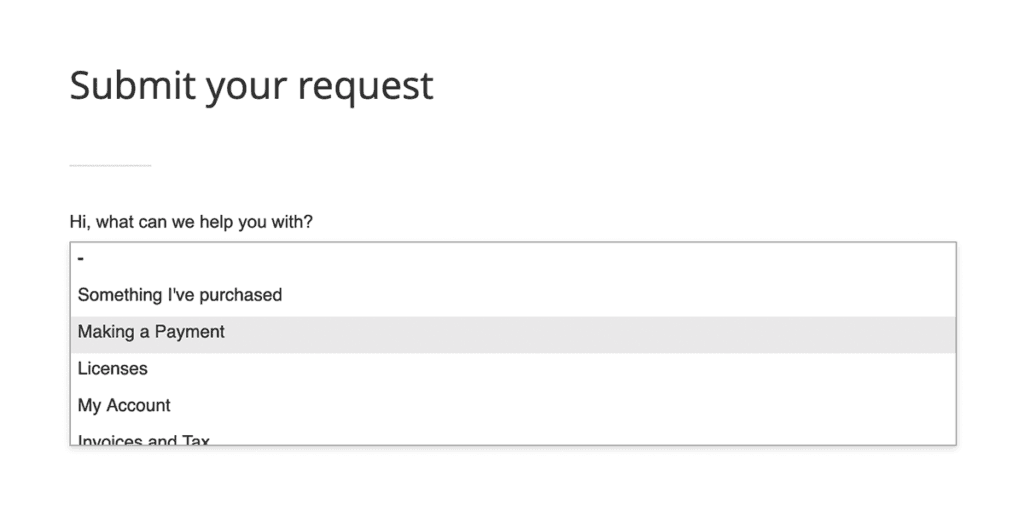
Leaves a very different impression, doesn't it?
Use conditional logic
This builds upon the previous point. Conditional fields are the bedrock of intuitive forms. You can create complex forms that adapt to customer inputs, while still being nimble. Conditional logic goes beyond hiding and showing fields. You can use conditional logic to:
- Send emails to certain people. Example, if Department is Sales, email [email protected].
- Show a form page: Example, If Additional info is Yes show page Add more info.
- Redirect to a URL. Example, if Issue type is Technical redirect to example.com/developer.
- Set value of other fields. Example, if Have you been here before is Yes, I have set value of field32 to Thank you for being a loyal customer.
- Trigger integrations. Example, if Feedback rating is less than 2 then trigger Zendesk ticket
Here is an example of how powerful conditional logic can be in a simple form:
This form can accept a wide variety of customer issue types - booking requests, complaints, feedback, and miscellaneous.
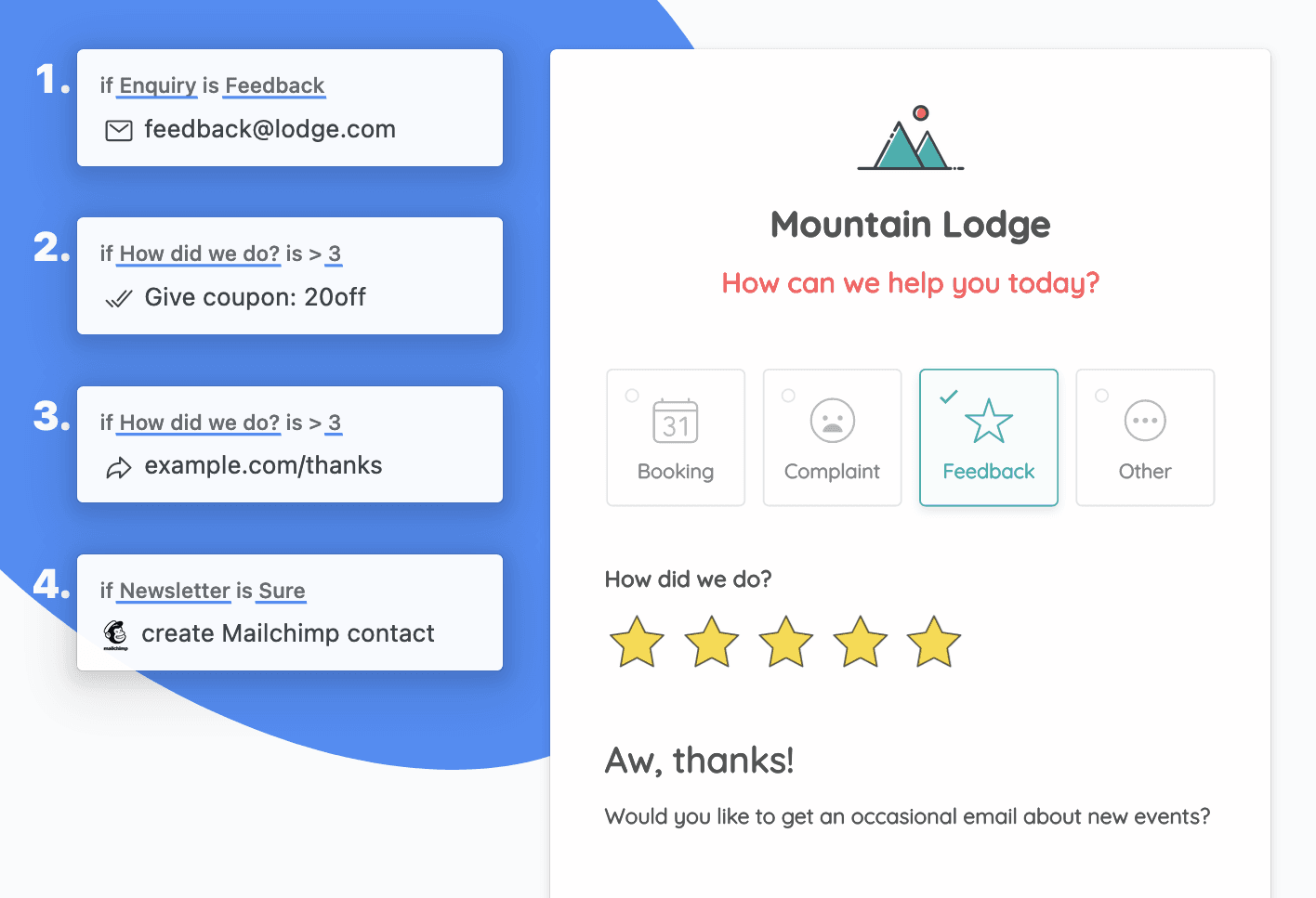
Here is an example flow:
1. Since the customer selected Feedback we will email [email protected] with the form response data.
2. The customer gave us over 3 stars - we could treat them by offering a discount coupon code in the "thank you" message, and also redirecting them to a page thanking them for the high rating.
3. Lastly, the customer wants to join our newsletter so we would add them to our Mailchimp list.
Amazing, isn't it? Most form builders support conditional logic to some extent. Learn more about Formcrafts' conditional logic.
Use rich text
A good form isn't just about collecting information; it's also a communication tool. Use rich text elements like instructions, lists, images, or even short videos to guide users and potentially resolve their issues without needing a ticket.
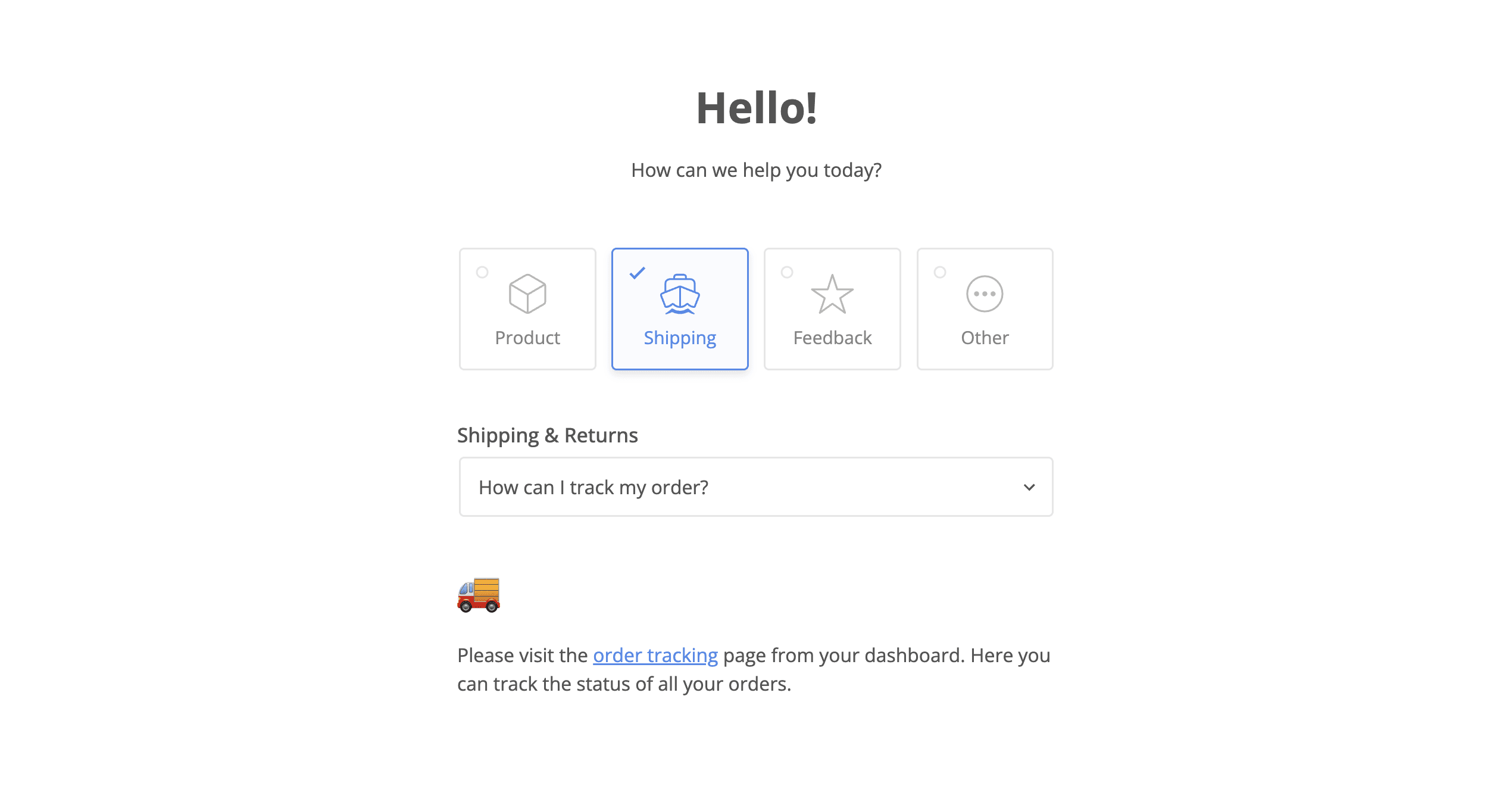
If the customer wants to create a ticket about order tracking we would try and point them in the right direction so they may not need to create a ticket at all.
Maybe the customer needs technical help fixing their bike. Instead of showing the ticket fields we could show a DIY video, and if the issue isn't resolved the customer can still fill out the ticket form.
Use searchable dropdowns
Dropdowns (or picklists) are an excellent and versatile field type. A good dropdown field should be able to:
- Work with a large number of options
- Group options under categories
- Be searchable
- Associate images with each option (bonus!)
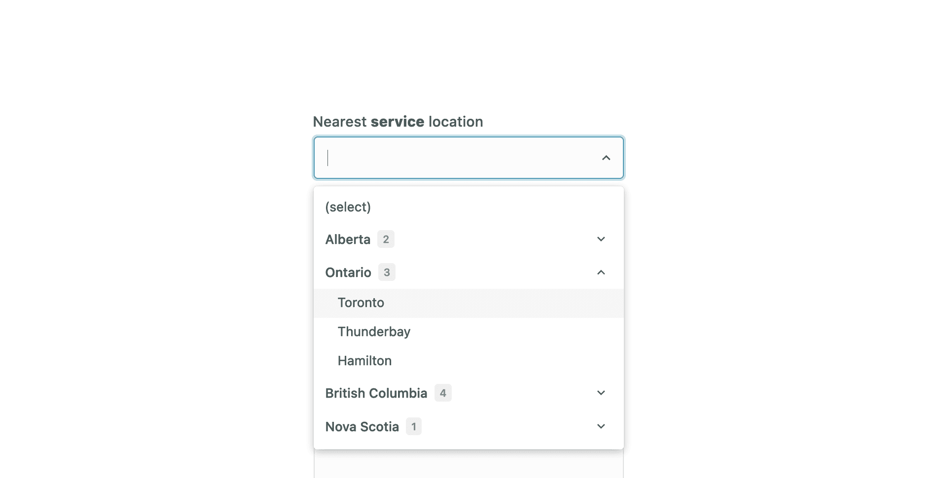
Example: you want the customer to be able to select a service location while creating a ticket. You have multiple locations in every state. What is the best way to put this in a field?
Imagine a customer trying to select a service location from a long list. A searchable dropdown with location categories would be a lifesaver. Ideally, these dropdowns should allow for a large number of options, grouping under categories, be searchable, and even have the possibility of adding images.
Embed the form on your website
Make sure your Zendesk form is readily available to your customers. Embed it on your help center, contact us page, or even within your app's dashboard. The easier it is for users to find the form, the quicker they can get the help they need.
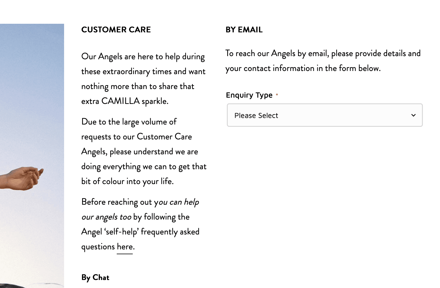
A great example is our client Camilla's website (image included). Their seemingly simple form utilizes conditional logic to guide users and seamlessly adapts its appearance based on their selections.
Conclusion
By following these five tips, you can transform your Zendesk ticket form from a hurdle into a helpful tool that improves customer satisfaction and streamlines your support operations.

